Atlanta Contemporary Music Collective Branding
Shape builder, motion blur, and Canva

New identity for a constellation of contemporary classical musicians: January - April 2025.
Towards the end of January, I took on a brand refresh project for the Atlanta Contemporary Music Collective. They needed help with some templates but also wanted to know if they could get a logo, color palette guidance, and the like. I took a call with them and thought this would be a fun project.
For this process, I tried to broadly follow the Allan Peters design process, where I get nouns from the client, generate black and white marks for them to approve, and then move on to color work. In the spirit of the Peters process, I also tried my best to do a better job sketching logo drafts. In general, I’m very much the sort of person who wants to see if an idea will work in a graphic very quickly and I often skip a lot of the sketching. I’m trying to get better at the sketches.

Bryan at ATLCMC was very helpful in providing the nouns and other language to work off of. In doing this part of the exercise the words “constellation,” “transformation,” and “hub” stood out. Of these three, “constellation” was probably the biggest guiding word.
One thing about designing for music is that I always think it will be easy because I’ve been doing music for about 25 years. But then I got into it and realized that even when something is relatively niche like contemporary classical music, it’s way more broad than selling a product like skin care targeted to millennial women. I started this thinking I would have a smooth time, but then spent the first two weeks super lost. With creative work I often think of the cliche “what you seek you will find” or whatever the line is and instead of getting frustrated I tried my best to keep digging and working, and ultimately I ended up with something I’m pretty proud of.
The ensemble has been using ATLCMC as a wordmark for a while. As will be discussed when we get to typography, their wordmark has been the abbreviation in Alata font. I wanted to make something slightly more custom, something more in the spirit of a constellation. In Illustrator I made a grid of circles nested within squares and then used the shape builder tool to connect them. We went through a bit of a back-and-forth to decide on which letters we liked before coming to a final resting place.
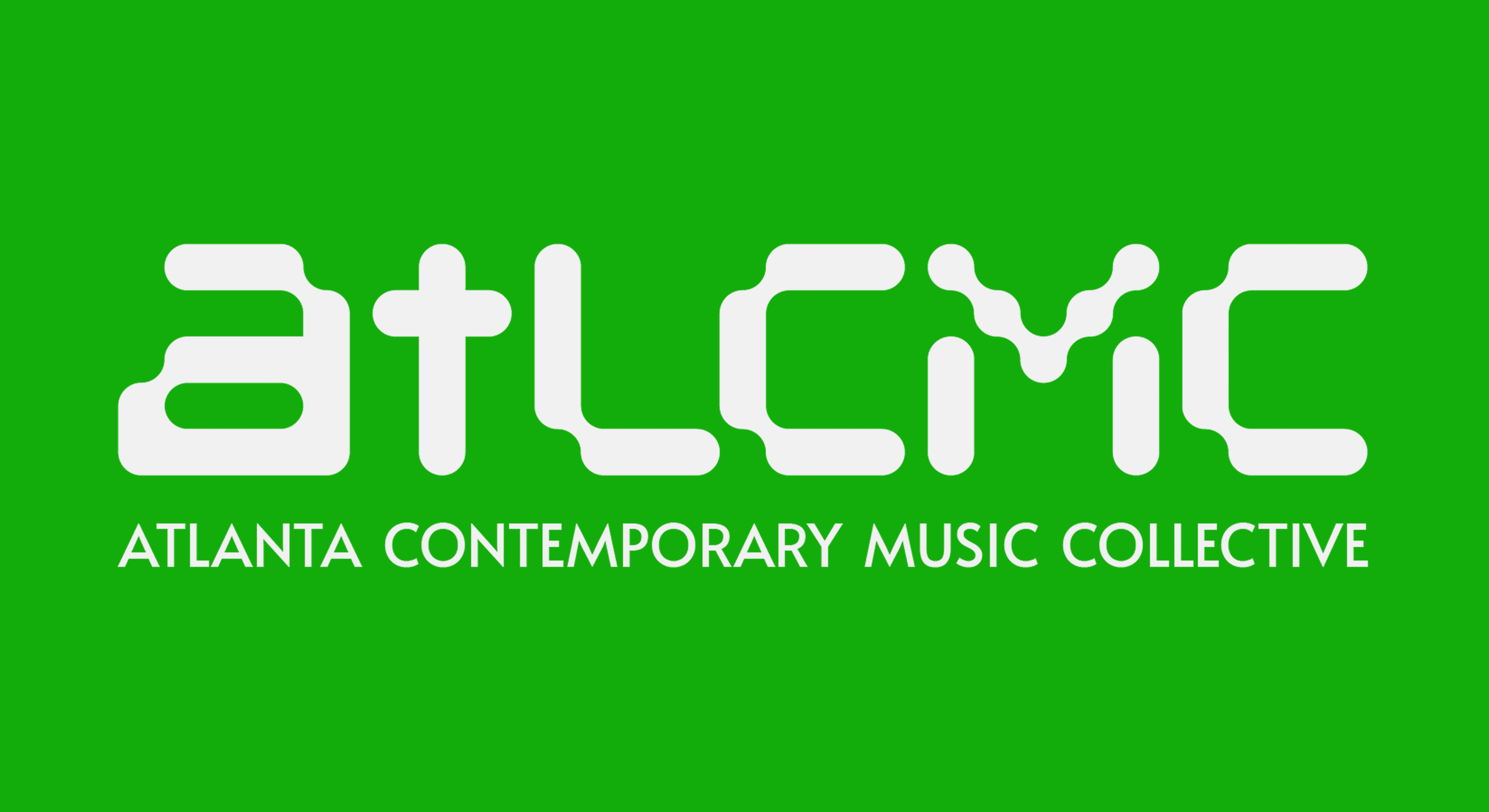
The family of logo symbols also uses the idea of a constellation. Using a similar technique in Illustrator, I built figures based on a transforming letter “a.” ATLCMC has three types of performances that vary in size based on the number of players required. I decided to offer a sub-logo that could be used in place of the primary symbol as desired for each of those types of performances. As the number of musicians on stage grows, so too does the logo become more ornate.

We went through a pretty solid revision process on these symbols getting feedback from both Bryan and the board. Originally these logos were rotated 45 degrees to be more of a square shape. In this configuration, they were more abstracted. In the revision stage it was requested I rotate them to the way they’re displayed here. It becomes more clear that they are based on the letter “a” in this setup.
Similarly to my recent work for LCC, I wanted this work to build upon what ATLCMC has already got going on design-wise. An easy starting point for this was typography. They have been using Alata font as their primary font. It’s an interesting font with a lot of personality that I don’t often see. However, I worried that when using a lot of that font in a document such as a donor pamphlet it would lose a bit of its charm.

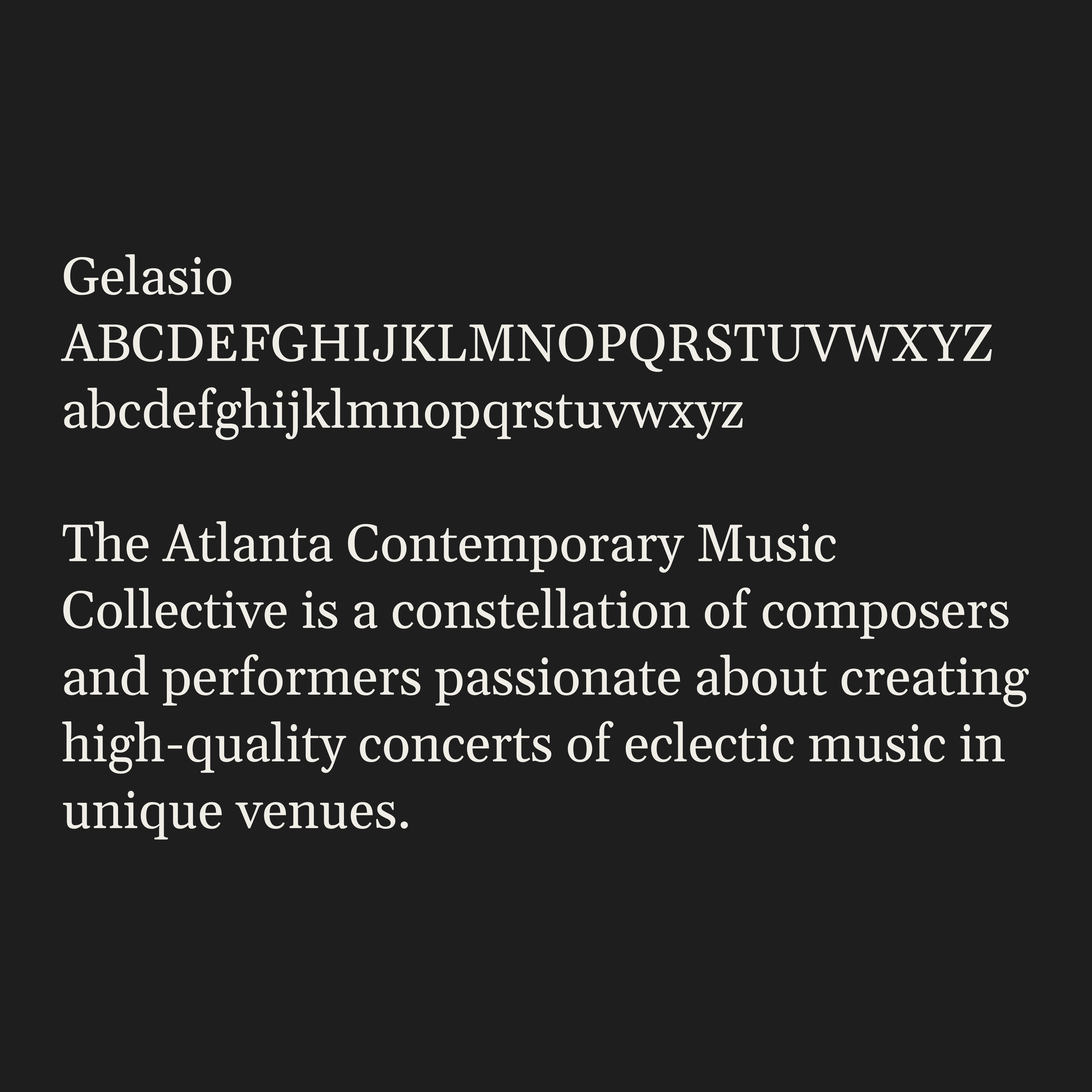
I found a more traditional serif font called Gelasio I decided to recommend as a pair. Both fonts are available for free on Google Fonts. I have also suggested Georgia as an alternative to Gelasio when working in Canva.
It was requested that a great degree of flexibility of color would exist in these guidelines. They actually hope to use a different color palette for every season. Initially, my marketing and communications antenna went up, and was concerned with this, but ultimately I thought it would be fun to try and figure out how to make it work. I took a bit of their existing color work as a starting point. I decided to darken them up a bit and put forth a green color as a quasi-primary choice. I built them a palette that I’ve recommended they use as a first-choice palette, to be used on standard materials like impact graphics or donor materials.
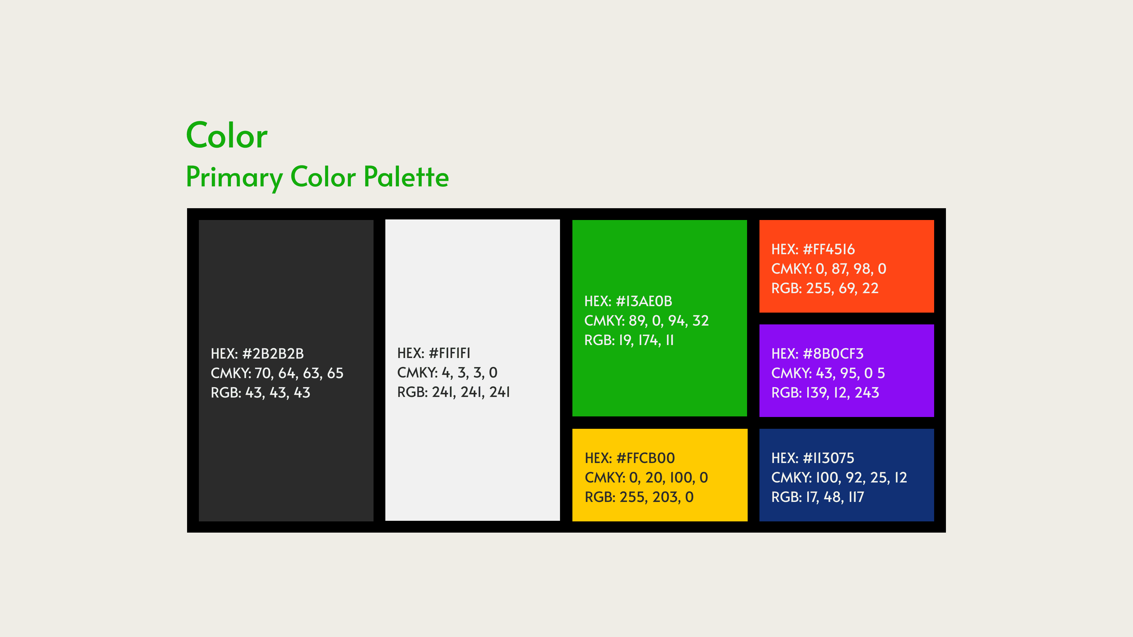
For additional color options, I built them a secondary palette which they can add to as desired. Originally I thought of trying to make a Schoneberg-esque twelve-tone kind of color matrix. I simplified this and instead took the colors from the primary palette and generated some micro-palettes where they have three colors or so to pick from.


In some of their existing design work, ATLCMC uses a few little geometric figures and markings. I decided to take this and abstractly apply it to a new set of graphics. I applied some motion blur, a liquifying effect, gradient overlay, and some noise to photos found on Unsplash in order to create a library of background graphics.

ATLCMC does its work in Canva. As such, it was important to me to be able to set them up with their material in Canva. Like many others, when I started doing design I also used Canva. However, I will confess that in the last few years, I haven’t really touched it, as I’ve been hard at work getting better at the various Adobe programs and Figma. Canva’s branding tools are really helpful, and ATLCMC has been set up to have all of their logos, fonts, colors, and some document templates ready to go as they need.
At this point, they’ll be having someone on their team make some material for the 2025-2026 season that I’ll get to help review in a more consulting sort of role. Work will be rolled out early summer of 2025 for next season!
If you are interested, you can view the brand guidelines document I created for ATLCMC here.
