Emerald Spring
Healthcare for a happy, healthy life.
Research
Through conducting user interviews I noted that users have trouble in other interfaces selecting the doctor that is right for them.
Additionally, parents of multiple children find it difficult to easily select which child’s health they are taking care of.
With more and more healthcare providers moving to having patients complete forms pre-appointment, older users struggle to fill out required forms and medical histories before their appointment.
Ideation
I started with some paper sketches of the homepage. From research I noted that the websites of competitors are often very visually heavy, using only the minimal necessary text. I wanted to easily capture the two key areas – finding a doctor, and completing the forms for your upcoming appointment with lots of imagery.
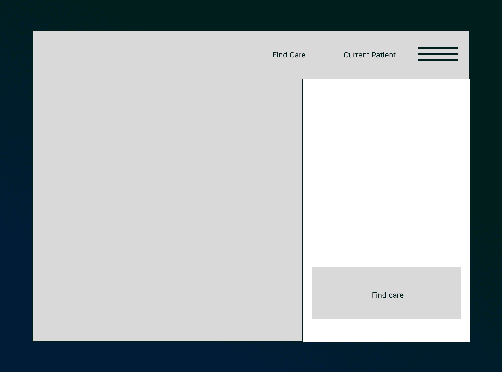
I converted the paper sketches to wireframes in Figma. I made a few layout changes before moving to prototyping.
Testing and finalizing the designs
After getting my wireframes together, I conducted a round of usability testing. A key insight I gathered from my tests is that I learned I needed to make it clearer how you can select the account of a specific patient to manage. The below design reflects that change. When selecting an individual patient, I added the ability to quickly schedule or manage an appointment, or complete the necessary check-in forms from a drop down menu.


